transform 속성으로 요소를 이동, 회전, 크기 변경, 기울이기 등 2D/3D 변형을 수행하고,
transition과 animation 속성으로 CSS 속성 변화와 복잡한 애니메이션 효과를 구현합니다.
Flexbox는 1차원 레이아웃 시스템으로, 컨테이너와 요소 속성을 활용하여
유연하고 반응형인 레이아웃을 구현합니다.
CSS Grid는 2차원 레이아웃 시스템으로 행과 열을 동시에 제어하며,
multi-column 속성으로 신문과 같은 다단 레이아웃을 구현합니다.
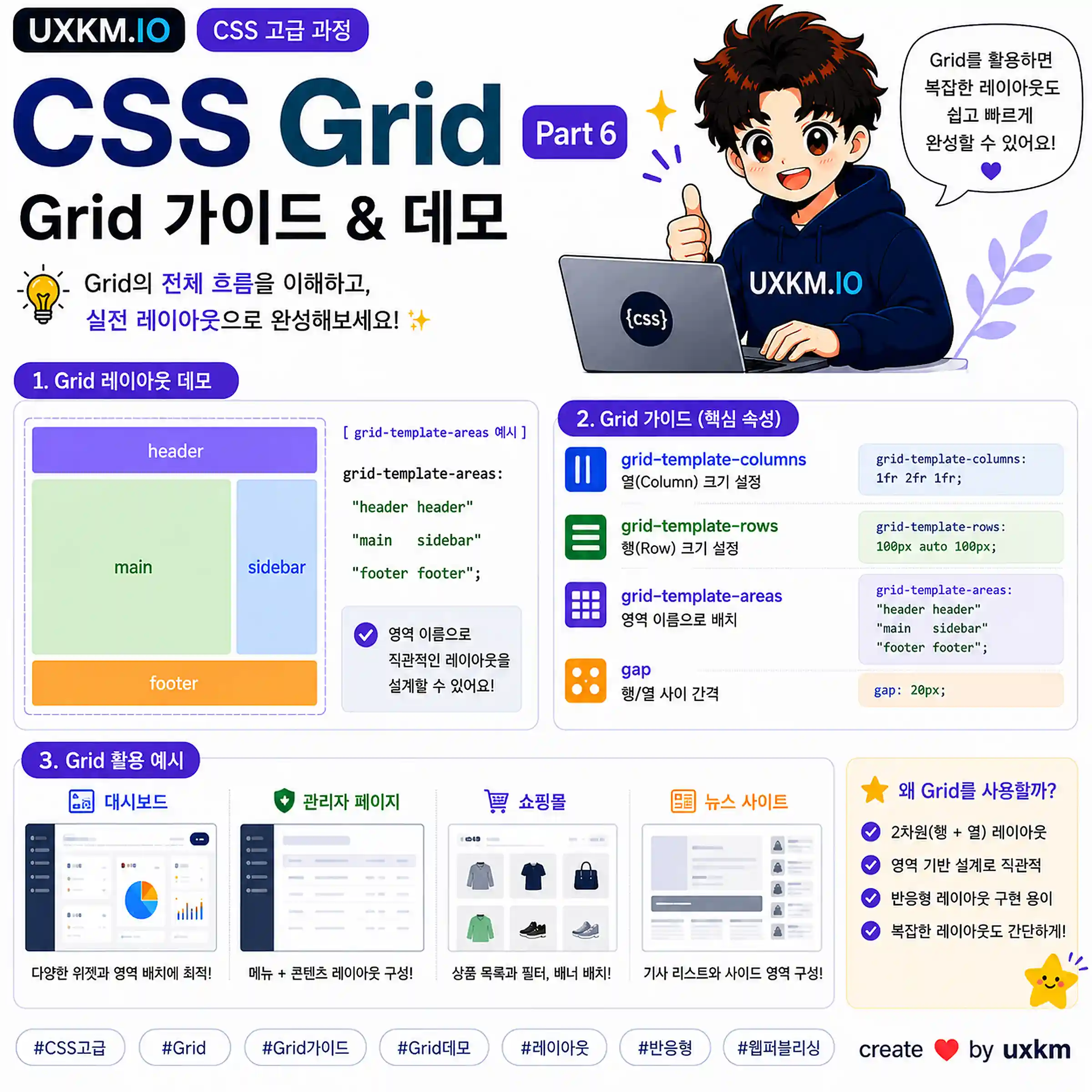
그리드 레이아웃 가이드, 데모- by. UXKM
Publishing
CSS
CSS 고급
그리드 레이아웃 가이드, 데모
요약 설명
CSS Grid는 웹 페이지 컨텐츠를 행과 열로 나눌 수 있는 2차원 레이아웃 시스템입니다. display: grid 또는 display: inline-grid로 설정한 요소가 그리드 컨테이너가 되며, 그 안에 포함된 자식 요소들이 그리드 아이템이 됩니다.
flex는 1차원 레이아웃(행 또는 열)을 다루지만, grid는 2차원 레이아웃(행과 열)을 다룹니다.
복잡한 레이아웃을 구현하는 데 유용하며, 브라우저 대부분이 완벽하게 지원하고 있습니다.
box정렬 가이드
요약 설명
Box 정렬(Alignment)의 일부 동작은 레이아웃 방법에 따라 달라집니다.
CSS Grid / Flexbox의 각 레이아웃 방법에 따라 아이템 정렬이 어떻게 다르게 설정되는지 비교해봅니다.
box 정렬의 핵심 개념
컨테이너 요소는 포함하는 아이템 자식 요소를 정렬할 수 있습니다. 정렬의 유형을 세부적으로 구분하면 다음 3가지로 나눌 수 있습니다.
위치 정렬 - start, end, center와 같은 키워드
기본 정렬 - baseline 키워드와 first/last 수정자(Modifiers)
분산 정렬 - stretch, space-between, space-around, space-evenly
이러한 키워드 값의 대부분은 문서의 쓰기 모드(Writing modes)와 관련되어 작동합니다.
글의 흐름이 좌 ⟹ 우 방향이라면 그리드 컨테이너의 왼쪽이 start 가 됩니다. 반대로 우 ⟹ 좌 방향이라면 오른쪽이 start가 됩니다.
[ Box 정렬 좌 ⟹ 우 / 우 ⟹ 좌 ]
block / inline 축(axis)
블록과 인라인 축은 레이아웃 방법에 따라 다르게 사용됩니다.
블록 축은 grid에서는 컬럼(column) 축으로, flexbox에서는 교차(cross) 축으로 사용됩니다.
인라인 축은 grid에서는 로우(row) 축으로, flexbox에서는 주(main) 축으로 사용됩니다. grid는 언제나 명시적인 행/열을 가지고 있어 축을 기준으로 하는 정렬을 이해하기 쉽습니다.
하지만 flexbox는 주 축(main axis) 방향이 바뀔 때마다 정렬 기준이 변경되므로 주의해야 합니다.
block 축 (수직)
grid - column 축
flexbox - cross 축
inline 축 (수평)
grid - row 축
flexbox - main 축
[ Block / Inline 축(Axis) ]
align-self / align-items
align-* 속성은 블록 축(수직 방향)과 관련된 속성입니다.
grid 레이아웃은 column 축에 해당되며, 명확하게 수직 방향으로만 정렬이 설정됩니다.
반면 flexbox는 flex-direction 속성 설정에 따라 교차 축의 방향이 바뀌기 때문에, 교차 축에 영향을 받는 align-* 속성의 정렬 또한 바뀝니다.
grid와 flex 비교
grid
정렬 컨테이너
Grid 영역(Area)
기본 동작
일정 비율을 가진 아이템을 제외하고는 stretch가 설정된 것처럼 늘어난 형태로 동작합니다.
설정 가능한 값
												auto, normal, start, end, center, stretch,

												baseline, first-baseline, last-baseline
허용 범위
블록 / 컬럼(column) 축
예시
align-self의 기본 동작은 stretch 입니다. start 값을 설정하면 그리드 컨테이너 블록 축의 시작 부분에 정렬됩니다.
flex
정렬 컨테이너
아이템이 있는 Flex 라인
기본 동작
stretch 값이 기본 입니다.
설정 가능한 값
												auto, normal, flex-start, flex-end, center, stretch,

												baseline, first-baseline, last-baseline
허용 범위
블록 / 교차(cross) 축
예시
align-self의 기본 동작은 stretch 입니다.
flex-direction 설정 값에 따라 늘어나는 방향이 변경됩니다. row일 경우 height,
column일 경우 width로 설정됩니다. start 값을 설정하면 교차 축의 시작 부분에 정렬됩니다.
justify-self / justify-items
justify-* 속성은 인라인 축(수평 방향)과 관련된 속성입니다.
grid 레이아웃은 row 축에 해당되며, 명확하게 수평 방향으로만 정렬이 설정됩니다.
반면 flexbox에는 justify-self, justify-items과 같은 속성을 지원하지 않습니다.
개별 아이템을 주 축 방향을 기준으로 정렬하고자 한다면 margin 속성을 사용할 수 있습니다.
grid와 flex 비교
grid
정렬 컨테이너
Grid 영역(Area)
기본 동작
일정 비율을 가진 아이템을 제외하고는 stretch가 설정된 것처럼 늘어난 형태로 동작합니다.
설정 가능한 값
												auto, normal, start, end, center, stretch,

												baseline, first-baseline, last-baseline
허용 범위
인라인 / 행(row) 축
예시
justify-self의 기본 동작은 stretch 입니다. start 값을 설정하면 그리드 컨테이너 인라인 축의 시작 부분에 정렬됩니다.
flex
justify-self 속성은 Flexbox에 적용되지 않습니다.
주 축에 여러 아이템이 존재해 이들 중 하나를 조정할 수 없습니다.
주 축에 콘텐츠를 정렬하고자 한다면 아래 작성된 justify-content 속성을 참고하세요.
인라인 축에 하나의 아이템만 정렬하고자 한다면, margin 속성을 사용해 아이템을 정렬할 수 있습니다.
align-content
align-content 속성은 블록 축(수직 방향)과 관련된 속성입니다.
grid 레이아웃은 column 축에 해당되며, 그리드 컨테이너에 여유 공간이 존재할 경우 정렬이 반영됩니다.
flexbox 또한 컨테이너에 여유 공간이 있다면 정렬을 수행할 수 있습니다.
grid와 flex 비교
grid
정렬 컨테이너
Grid 컨테이너(Container)
기본 동작
일정 비율을 가진 아이템을 제외하고는 stretch가 설정된 것처럼 늘어난 형태로 동작합니다.
설정 가능한 값
												normal, start, end, center, stretch,

												space-between, space-around, space-evenly,

												baseline, first baseline, last baseline
허용 범위
블록 / 열(column) 축
요구 조건
그리드 컨테이너의 여유 공간
예시
그리드 트랙 크기가 컨테이너 크기보다 작은 경우, 시작 부분에 정렬됩니다. space-between 값을 설정하면 블록 축(수직 방향)을 기준으로 공간을 분산 정렬합니다.
flex
정렬 컨테이너
Flex 컨테이너(Container)
기본 동작
stretch 값이 기본 입니다.
설정 가능한 값
												normal, flex-start, flex-end, center, stretch,

												space-between, space-around, space-evenly,

												baseline, first baseline, last baseline
허용 범위
블록 / 교차(cross) 축
요구 조건
컨테이너가 아이템보다 표시할 수 있는 공간이 주어질 경우, 정렬을 사용할 수 있습니다.
예시
align-content 속성은 컨테이너에 여유 공간이 있을 때 공간을 분산 정렬하도록 설정할 수 있습니다.
justify-content
justify-content 속성은 인라인 축(수평 방향)과 관련된 속성입니다.
grid 레이아웃은 row 축에 해당되며, 그리드 컨테이너에 여유 공간이 존재할 경우 정렬이 반영됩니다.
flexbox 또한 컨테이너에 여유 공간이 있다면 정렬을 수행할 수 있습니다.
grid와 flex 비교
grid
정렬 컨테이너
Grid 컨테이너(Container)
기본 동작
일정 비율을 가진 아이템을 제외하고는 stretch가 설정된 것처럼 늘어난 형태로 동작합니다.